If history is our guide, we are on track for a severe market meltdown in 2019. While the U.S. broader indexes remained in record territory for most of 2018, December turned out to be a complete disaster for stocks. So, even though the markets have reversed higher from their Christmas Eve lows, this is nothing more than a bear market rally.
It’s really that simple. Thus, all the hype about “Fed Market Rigging” to push the markets up a record 1,000 points following the Christmas Eve massacre, becomes white noise as markets always correct higher after a massive selloff, with or without the Plunge Protection Team (PPT). Furthermore, the notion put forth by members of the Alt-Media suggesting that the Fed rate hikes will cause another market crash, and wealth transfer makes no sense in an EROI Collapse (Energy Returned On Investment).
As the EROI of the oil industry falls even lower with the addition of oil sands and shale oil, there will come a time when the economy and market will disintegrate due to a lack of profitable net energy. In this future net-energy-starved economy, most ASSETS will become LIABILITIES. So, the lousy conspiracy that the Fed is using their “rate hike policy” for the “grand elite wealth transfer,” needs to be thrown in the waste bin for good.
Folks, it’s time to stop focusing on lousy conspiracies and figure out what you are going to do when energy becomes a real problem.
Unfortunately, hype and conspiracies sell a lot of books and subscriptions because they are more exciting than facts, data, and information. It seems to me that a large number of the Alt-Media followers are being misled just as much as their Mainstream media counterparts. However, they don’t realize it… LOL.
Okay, let’s get back to the 2019 Market Meltdown.
2019 MARKET MELTDOWN: Bigger & Better Than Ever
The main reason the broader markets are likely to crash in 2019 has to do with the simple fact that the BOOM CYCLE is OVER. We can spot this quite clearly in the unemployment chart below:
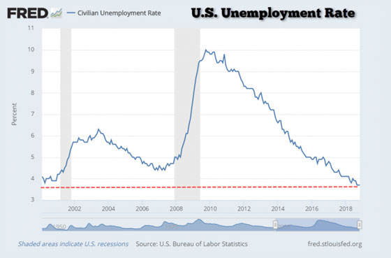
Anytime the U.S. unemployment figure is at a low, the cycle rolls over, and the fun begins. Yes, I realize the U.S. unemployment figures are manipulated. I have read the data from John Williams Shadowstats.com. However, if we go by the manipulated data, it still provides us with a reliable indicator… and that is, low unemployment is not a positive indicator for the economy.
As the stock markets start to roll over along with increasingly negative economic indicators (falling housing, auto sales, etc.), the BUST CYCLE has already begun. And this bust cycle may be one that we will likely never really recover. If we look at a longer-term U.S. unemployment chart and the bubble periods, there may not be another means to prop up the economy in the future:
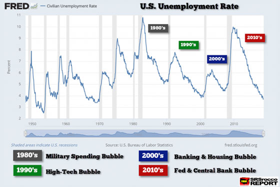
After the World War 2 suburban boom and burgeoning manufacturing economy during the 1950s to 1960s, the United States economy began to get into trouble when its domestic oil production peaked in 1970. Then after Nixon dropped the gold-dollar peg in 1971, it ushered in a decade of massive consumer price inflation. Thus, higher costs forced U.S. manufacturing to go overseas.
To combat the loss of manufacturing, the invisible hand of the U.S. economy brought on a series of bubbles to continue the American Dream. During the 1980s, we had a massive domestic military spending bubble. The U.S. military budget surged in the 1980s, even though there were no wars or large military conflicts. This helped boost the economy and bring the unemployment rate down from nearly 11% to 5% by the late 1980s.
Then we had the next recession (shown in the gray areas in the chart), and unemployment shot back up in the early 1990s. It wasn’t until the next bubble, the High-Tech Bubble, did the U.S. economy flourish once again. With the addition of thousands of DOT.COM stocks and grandmas at bingo bragging about their favorite trading picks, the unemployment rate fell back to 4% in 1999.
As with all boom cycles, they come to an end. However, the collapse of the Nasdaq and broader markets in the early 2000s was short-lived as the Fed and Wall Street initiated the next market bubble, and that was the Banking and Housing bubble. While the Fed lowered interest rates to help more Americans to afford homes, Wall Street came up with an ingenious plan (Mortgage Backed Securities) to get any POOR SLOB in a house that would never qualify for a home.
Everything seemed to be just peaches in 2008 until the bottom of the market fell out. The collapse of Lehman Brothers, Bear Stearns, and the entire U.S. housing market, created a global-wide recession. As the money markets started to seize up and real panic began to spread throughout the entire financial system, the Fed and Central Banks came in and propped up the global markets.
In just the past ten years, the top Central banks have purchased over $11 trillion in assets and this doesn’t include the tens of trillions of additional public, corporate, and private debt. Now, the important question is… who is going to bail out the Central Banks??
So, with the “manipulated” U.S. unemployment figure at a five-decade low of 3.7%, we are in for one HELL OF A WILD RIDE down the rollercoaster.
How The 2019 Market Meltdown Might Look Like
Sometimes history repeats or at least, rhymes. If we look at what took place in the Dow Jones Index from 2007-2009, we can get an idea of what lies ahead in 2019. This chart was posted in a ZeroHedge article, A “Shocking” Chart From Nomura: “The S&P Now Looks Just Like The 2008 Crash”:
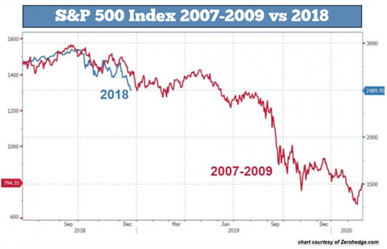
This chart shows the S&P 500 from 2007-2009 (RED) compared to the same index in 2018 (BLUE). We can see that there are some similarities with the past and present S&P 500 Index correction. However, I like to focus on the Dow Jones Index. If we look at the Dow Jones Index, we can see what took place in 2007-2009:
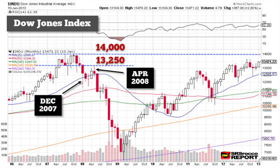
In December 2007, the Dow Jones experienced a large sell-off but corrected higher before the end of the month. The large wick at the bottom of that candle shows just how far the Dow fell. It lost nearly 3,000 points before reversing higher. Over the next four months, the Dow consolidated and moved back up to the 13,250 resistance level. Once the Dow Jones Index touched that resistance level, it then fell precipitously over the next ten months.
In looking at the Dow Index today, we also see another large sell-off in December. Interestingly, the Dow Index closed on the last day of the year right on the 25 Month Moving Average (BLUE).
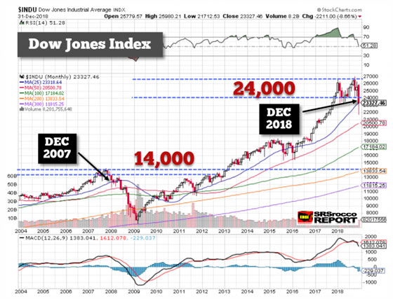
I believe the Dow will try to consolidate higher over the next few months and will probably try to retest that 24,000 level. Of course, there is no guarantee that this will happen, but I have been watching the markets more closely now, INTRA-DAY TRADING, and I can tell you, that is how the markets work.
Now, because the Dow Index is much higher and has a great deal more leverage and less liquidity today than it did in 2008, we could see a much steeper crash. But, if we don’t get a panic crash, it will likely take until the end of 2019 or early 2020 before the market reaches a low, but not the ultimate low.
If you look at the 300 Month Moving Average line (PURPLE), you will see that the Dow Index fell right to it in the first quarter of 2009. If it does the same thing this cycle, it will at least fall back to the 11,800 level (shown on the right). Again, this will not be the ultimate low in the Dow when the Falling EROI destroys the business cycle for good.
Why The Indexes & Stocks Trade Like They Do
As I mentioned, I have been watching Intra-Day Trading and how stocks and indexes move up and down off their technical levels. There is some logic in how the stock market trades. For example, the SPY Index is an S&P 500 ETF. The majority of stocks trade along with the SPY Index. If the SPY goes up, so do most stocks and if the SPY trades lower, so do most stocks.
As we can see, the SPY Index trades off of technical levels shown below:
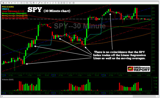
You will notice that the SPY index bounces off the Linear Regression Lines (RED & BLUE Dash Lines). This is a 30-minute chart, so each candlestick represents 30-minutes worth of trading. We can see the same thing take place on a longer time frame, on the SPY weekly chart:
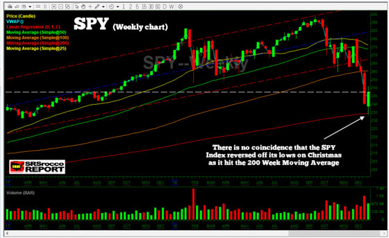
The SPY Index trades off its moving average and the Linear Regression Lines. When the SPY fell to its 200 Week Moving Average on Christmas Eve, it reversed higher. Nothing goes down in a straight line. So, there will be corrections down to its long-term bottom.
Let’s use one more example, Barrick Gold (ABX). Here we can see that ABX is trading off its Linear Regression Lines as well as its moving averages:
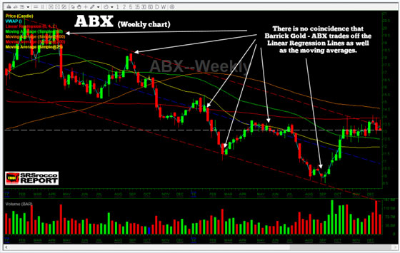
The reason stocks bounce off these technical levels is that professional traders and computer algorithms use them as a guide. I will be posting more charts like this in future articles because it will provide a guideline on how the market will trade in 2019.
While it is true that the Falling EROI will still destroy economic growth, it will take some time. So, the technicals will provide some clues about how this plays out in the future.
Lastly, the broader markets will continue to sell off in 2019 as the cycle is rolling over. I believe gold and silver will disconnect from the broader markets and move higher in 2019 as investors look to protect wealth during a major market meltdown.

About the Author:
Independent researcher Steve St. Angelo started to invest in precious metals in 2002. In 2008, he began researching areas of the gold and silver market that the majority of the precious metal analyst community has left unexplored. These areas include how energy and the falling EROI – Energy Returned On Invested – stand to impact the mining industry, precious metals, paper assets, and the overall economy.


