Infographics by Money Metals Exchange
Learn How to Invest in Precious Metals through Visual Representation
Money Metals Exchange is a national precious metals dealer that provides a number of ways for savvy investors to explore precious metals investing information and trends. Our site includes a wide range of exclusive resources and content to ensure that investors are always in the know when it comes to the precious metals markets.
The Money Metals Exchange infographics section helps novice and expert investors alike discover information about precious metals investing through visual illustrations.
Precious Metals Infographics
Visuals are key in attempting to reach the masses. History supports this statement, in fact, take one look around; No matter where you are, there will be some kind of visual representation present whether it be a logo, banner, sign or a simple photo. Illustrations are much more attention grabbing than a medium full of text. In a recent study of 1 million Google search results, it's estimated that over 96% of pages that included some type of visual content performed better than content without images.
The infographics section was created in hopes of making intricate information more consumable through the combination of concise data and clearly crafted images. Our infographics are all created in house and curated using information provided from reputable resources from all over the precious metals atmosphere. Some of the references used in our infographics include the CPI Inflation Calculator, The Silver Institue, and The Jubilee Centre to name a few.
Our Process
We scour the precious metals investing world for data to craft infographics that we feel will give our customers clarity on issues that may seem complicated at best. There is a plethora of data and facts that have been covered meticulously throughout the years in terms of precious metals info. In the event that this valuable information gets a bit confusing, we break it down in the most easily consumed format. We pride ourselves on creating illustrations that investors of all levels can enjoy and digest effectively.
Our Work
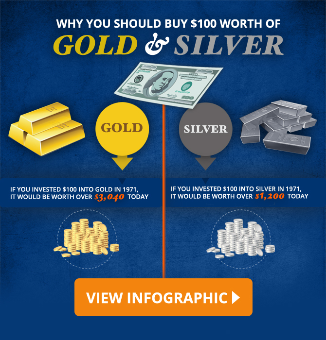
How Much is Silver Worth?
Purchasing power, inflation and deflation can be very complicated when attempting to explain from a statistical standpoint. It entails a ton of data to analyze. We thought it would be essential to translate this info into an infographic. In this visual, we explored the value of a $100 silver/gold investment from 1971 and how much it would be worth today. In result, we then presented examples of purchases that could be made with the increased cash as a result of inflation.
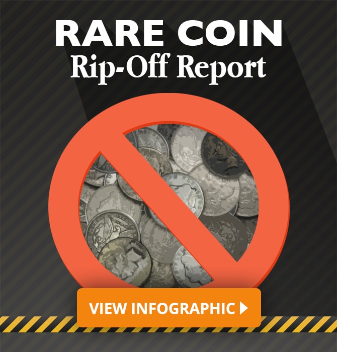
Rare Coin Rip-Off Alert
One of the biggest concerns of precious metals investors is to find the right type of protection to fight against financial turmoil. Unfortunately, mixed signals are prevalent between rare coins and bullion. Morgan Silver Dollars in particular have been used by rare coin dealers to rip off countless precious metals buyers. We broke down the most valuable pieces of information and presented a simplified explanation to the age-old battle between bullion and numismatics.
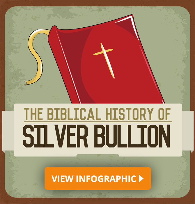
The Biblical history of Silver Bullion
In this infographic, we tackled the usage of precious metals in biblical times. Silver in particular plays an interesting role throughout the Bible and in folklore as well. From its usage as a currency to its industrial purposes, silver has a vast history throughout its existence. The infographic gives a brief take on the unique properties of the white metal along with particular passages to exemplify its usage.
New and significant precious metals data is all over the web. So there is always a need to translate data that may be unwieldy in text form. Look out for more infographics from Money Metals Exchange in the future.