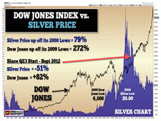
While the Dow Jones Index and broader markets are recovering from their lows set on Friday, the worst is still yet to come. Investors need to realize that stock market indexes don’t fall in a straight line. Also, there is the possibility that the Dow Jones Index could surpass its previous high of 26,600 points. Only time will tell.
However, the leverage, margin, and insane valuations in the markets are still way out of whack. Just because the Dow Jones Index has added 1,200 points from its lows in early Friday trading, it is still 2,000 points below its peak of 26,600. Furthermore, when the Dow Jones peaked at 14,100 points in 2007, it took six months and three different peaks before the index started to fall off a cliff in 2008.
For example, the Dow Jones Index hit three peaks in 2007:
- July 2007 = 13,900
- Oct 2007 = 14,100
- Dec 2007 13,600
Over those six months in 2007, the Dow Jones Index rose and fell three different times. The biggest percentage drop was between July 2007 and Oct 2007, at nearly 10%. However, the Dow Jones index peaks were at the most, 3.5% from their high of 14,100. Moreover, it took six months for the Dow Jones Index to finally head lower on a sustained basis and it wasn’t until nearly a year later in Oct 2008 did the market finally crash.
So, if you think the Dow Jones correction is over, then you are going to be in for a rude awakening.
I put together my analysis of the Dow Jones Index and the Silver Price Trend in my newest YouTube video:
Not only do I discuss the Dow Jones Index and the Silver Price, but I also explain what is going on in the oil and housing market. Unfortunately, I believe we are sitting on top of the biggest bubble economy in history. While it is impossible to know when the EXACT TOP will be in, the higher we go from here, the bigger the bubble becomes.
To tell you the truth, I would be amazed to see the Dow Jones Index surpass its previous high of 26,600. But, there is a chance that it COULD HAPPEN. But again, the higher the Dow Jones Index goes…, the bigger the inevitable fall.
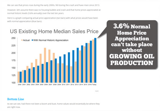
In the video, I also discuss the delusionary and superficial analysis that the U.S. Housing Market is not in a Bubble. In this chart below, it explains that if the Housing Boom and Bust were removed from the equation and we used a 3.6% annual historical appreciation rate, the median home price would be about the same:

Of course, this is pure BOLLOCKS because compound interest over a long period is impossible. Furthermore, you can’t enjoy rising appreciation if oil production growth slows or declines. For some strange reason, the analysts don’t factor that important TIDBIT into their forecasts.
I want to take this time to thank those followers who have supported my work by becoming MEMBERS on my site or PATREON. Your support is greatly appreciated so I can continue to put out the information, data, and analysis for the public benefit.

About the Author:
Independent researcher Steve St. Angelo started to invest in precious metals in 2002. In 2008, he began researching areas of the gold and silver market that the majority of the precious metal analyst community has left unexplored. These areas include how energy and the falling EROI – Energy Returned On Invested – stand to impact the mining industry, precious metals, paper assets, and the overall economy.


