Today we are getting another whiff of what’s wrong in the markets. Currently, the Dow Jones Index is down over 500 points, and the NASDAQ is off by more than 100 points. Who knows where the markets will finally end up at the close of trading, but it doesn’t matter. Markets aren’t valued in days or weeks; rather it takes months and years. So, be patient, and you will be rewarded with at least a 50% decline in the Dow Jones Index.
Unfortunately, a lot of traders, even some frustrated precious metals investors, forget about the STAGES OF A FINANCIAL BUBBLE. It seems like, after about ten years, all memory of the 2008 Financial Meltdown has been all but forgotten. While I can understand the “This time is different” by the Mainstream Media, I have to get a kick reading comments by disenchanted precious metals investors who have been swayed by the rampant insanity in the markets.
So, let me publish the stages of a financial bubble to remind those who have either been brainwashed by the Mainstream Media or who have just forgotten the fundamentals:
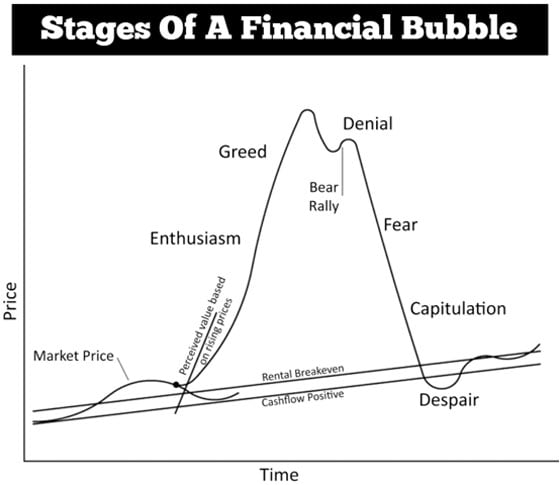
If I had to make a reasonable guesstimate, I would imagine we are somewhere going down the Peak slope or close to the Denial Stage. However, once the Dow Jones Index falls below 20,000, we will know that the markets have entered the Fear Stage. During the Fear, Stage is when I see the price and demand for precious metals increase. As we enter the Capitulation Stage, then we could experience precious metals demand as we have never seen before.
Let’s take a look at the current Dow Jones Index chart. As I mentioned in several articles and videos, nothing goes down in a straight line, and it will likely take 1-2 years before the Index reaches its lows. However, this will not be the Dow’s ultimate low. That will probably take another 10-15+ years.
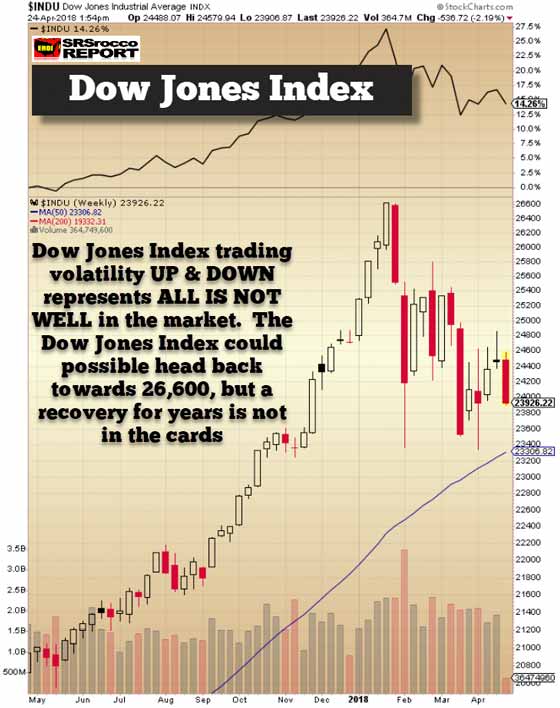
The Dow Jones Index hasn’t experienced this sort of volatility since 2007. Even though we had some corrections in 2011 and 2016, this current volatility is even worse because the FINRA margin debt is also near a record high. But first, before I show the FINRA margin debt table, let’s look at the MACD technical level on the Dow Jones Index going back until 1982:
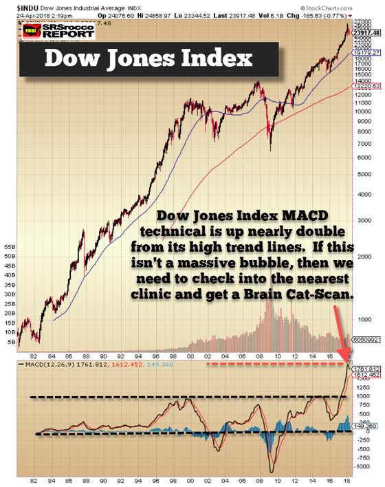
If we look at the MACD technical reading at the bottom of the chart, we can see a very ominous setup. The Dow Jones Index high trend-line (upper black dotted line) is about 1,000 on the MACD. As of trading today, the MACD is at 1,761. However, when the markets crashed in 2009, the MACD fell to a negative 1,000+ points. So, as you can see, the Dow Jones Index has a long way to fall before it first gets to the “O” baseline.
Again, if you believe this time is different and you can’t see how over-valued the Dow Index is based upon the MACD technical, then maybe it might be prudent to allow a Doctor to take a Cat-Scan or MRI of the space above your neck.
That being said, I do believe the TOP in the Dow Jones Index was likely 26,600. While we could see a higher high on the Dow, it’s probably a slim chance. Regardless, the folks at the NYSE stopped providing investor margin debt information at the end of 2017 because it just wasn’t necessary anymore. I gather the NYSE assumes that when the markets implode, and along with it, the margin debt, then THE END IS NEAR:
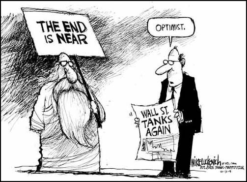
Gosh… this has to be one of my favorite cartoons by Mike Luckovich. I will be reposting this cartoon on very BIG DOWN market days.
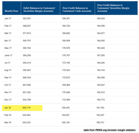
The wonderful folks at FINRA are still doing GOD’s work by providing us with this important information on the INVESTOR GREED FACTOR. Why the “greed factor?” Well, if you are trading on margin and are doing so at the top of the market unless you have completely lost your marbles, then one must be stupendously greedy.
For those who don’t know what FINRA stands for, it’s the Financial Industry Regulatory Authority. While the majority of investor margin debt is on the NYSE, the remainder is on other misc markets. According to the most recent release, FINRA margin debt fell from a peak of $665.7 billion in January (top of the market) to $645 billion in February and March:
While investors were spooked in February, it looks like they are still in the Denial Stage (first chart above). However, once we start to slide down the Fear Stage, the FINRA margin debt will implode in glorious 3D Technicolor.
To get an idea of where we are with the FINRA long-term margin debt, here is a chart from the folks at Advisers Perspectives:
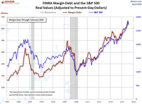
As we can see, the current FINRA investor margin debt of $645 billion is 30% higher than the peak in 2007 and nearly 50% higher than the top in 1999. So, it looks like the $645 billion margin debt has a long way to fall before it gets back to a low of around the low of $200 billion.
Regardless, the markets will continue to be volatile before we head down to the Fear Stage. However, it’s likely a good idea that individuals consider owning the best HEDGE, Precious Metals, against everything wrong in these markets before things get ugly in the markets. Please understand this is not a recommendation, but just something to consider before the markets become unglued.
IMPORTANT REMINDER: The Gold & Silver prices will not collapse along with the broader markets because they have been close to their lows for several years now while the markets are near their tops. I will be publishing an article on Top Two Gold Miners' cost of production towards the end of the week.
Lastly, I remain steadfast in my oil price forecast. While we could see higher oil prices due to the geopolitical and trade war machinations in the markets, the oil price will eventually fall when the markets start to disintegrate. I see the oil price down in the $30 range when the Dow Jones Index has lost 50+% of its value.

About the Author:
Independent researcher Steve St. Angelo started to invest in precious metals in 2002. In 2008, he began researching areas of the gold and silver market that the majority of the precious metal analyst community has left unexplored. These areas include how energy and the falling EROI – Energy Returned On Invested – stand to impact the mining industry, precious metals, paper assets, and the overall economy.