The biggest frustration to many precious metals investors is why have the gold and silver prices underperformed the market since 2011. Actually, for gold, it was since 2012. Even though gold hit a new record high of $1,900 in September 2011, its average annual price was higher in 2012 at $1,669 compared to $1,571 the prior year.
Regardless, the precious metals analysts back in 2012 were forecasting the market was going to experience even higher gold and silver prices, especially after the Fed announced QE 3 at the end of 2012. However, the precious metals community was taken by surprise as the gold and silver prices were hammered at the end of 2012 and into the beginning of 2013:
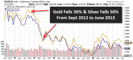
During this period, the gold price fell 30% and the silver price declined nearly 50%. Did something fundamental change in the markets for investors to suddenly ditch precious metals? Something really big happened... THE MARKETS BROKE. Of course, many in the alternative media believe the financial market died in 2008, but when we look at another indicator... it clearly shows that the markets drastically changed even further in 2012.
The following charts (below) from the article, Deutsche: The Market Broke In 2012, “This Is What Everyone Is Talking About”, show that the market is under-pricing RISK by orders of a magnitude never seen before. Now, when I say “under-pricing risk”, all that means is that the market has no idea of the dangers ahead. It is similar to someone driving a car that doesn’t realize the engine is burning up and the brakes don’t work because the WARNING LIGHTS aren’t functioning. So, the poor slob continues to speed down the road, without a care in the world… until the car blows up or he heads over a cliff.
In the Deutsche Bank article linked above, analyst Aleksandar Kocic provides actual evidence that the WARNING LIGHTS in the market are no longer working:
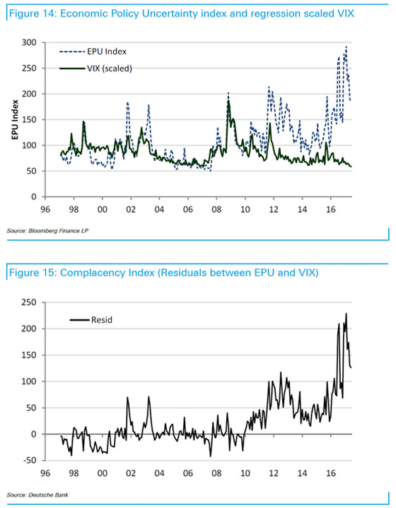
Regular readers are familiar with the Economic Policy Uncertainty (EPU) index which is constructed by counting the frequency of articles in ten leading US newspapers that contain three of the target terms: economy, uncertainty; and one or more of Congress, deficit, Federal Reserve, legislation, regulation or White House. These numbers are then properly normalized by their means and standard deviations of occurrence and combined into an aggregate index. As such, EPU is completely market independent (in the same way the mechanics of a coin toss is relative to any particular gamble).
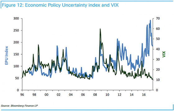
Okay… the description of the indicator above may be a bit difficult to understand, so I will simplify it. The BLUE LINE represents the “Economic Uncertainty Policy” (EPU index) shown by the frequency of articles in the mainstream media. The BLACK LINE is the VIX index, the volatility index (S&P 500). Economic uncertainty printed in articles in the Mainstream Media should correspond with the volatility indicator of the markets (the VIX).
And… this is precisely what took place from 1996 to 2011. The blue and black lines moved up and down in tandem. However, after 2011, something changed. According to Kocic:
Intuitively, when VIX is in tune with EPU, the market is acknowledging the levels of risk through the prices. However, when VIX is low and EPU high, markets are complacent – they are underpricing risk.
After 2011, the two measures of risk decouple with VIX consistently low despite growing uncertainty. The breakdown is structural, and it is visible across all market sectors, not only equities.
What Kocic is saying is that the market has become highly complacent and is seriously underpricing risk. In the next two charts, Kocic takes the difference between EPU Index and the VIX to get the second chart at the bottom. As we can see, something changed after 2011, and especially after 2016.
This chart is showing the level of COMPLACENCY in the market. From 1996 to 2011, the market complacency level fluctuated around the baseline. However, after 2011, market complacency is now trended much higher.
According to the article:
This is where things get even more interesting, because by this measure, “it appears that the markets have made a structural shift towards higher levels of complacency in the last six years.” Here, Kocic reverts to his old, cautious self, warning that this decoupling will end in tears. This is how he frames it:
Current levels of complacency are alarming. This is what everyone is talking about. Despite growing uncertainties and tensions, market volatility refuses to rise. Persistence of low volatility is increasing the penalty for potential dissent and reinforces one-sided positioning. As a consequence, the risk of disorderly unwinding is growing.
Because market volatility is so low, investors have been brainwashed to believe EVERYTHING IS OKAY. Unfortunately, the situation is quite dire because the market’s “Warning Lights” have been turned off.
I decided to take that chart above and show at what point the gold price peaked:
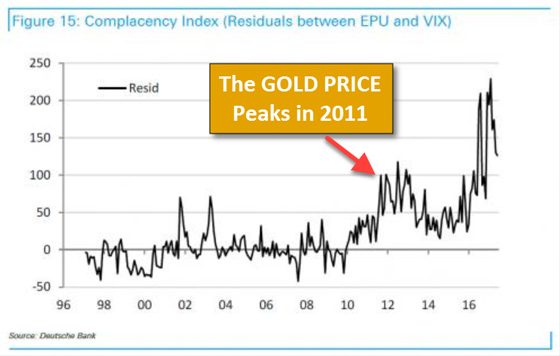
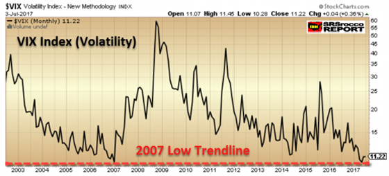
There’s no coincidence that the gold price peaked at the same time the EPU – Economic Policy Uncertainty Index decoupled from the VIX, shown at the end of 2011. The market has been deluded to believe that GOLD DOESN’T MATTER anymore. This is shown in the VIX index, as it continues to trend lower to the same level in 2007… before all hell broke loose in the markets:
Again, the EPU Index just shows how much “Uncertainty” is taking place in the markets via articles in the mainstream media. According to Kocic, the EPU Index below has been at a record-high level since 2016:
However, the VIX Index (volatility) is now at the same level it was in 2007. This means the market is disregarding ALL THE BAD NEWS coming out of the Mainstream Financial Media. Again, it is just like a speeding car heading down the road with an engine ready to blow and with no brakes, but the driver doesn’t know anything is wrong because the warning lights aren’t working.
So, for all the frustrated precious metals investors out there who continue to BELLY-ACHE and COMPLAIN that the “Analysts Got It Wrong” about gold and silver since 2011… have also been BAMBOOZLED, like the rest of the market, that EVERYTHING IS FINE. Well, it isn’t.
WHEN does COLLAPSE happen??
If I had that answer, I would be able to pick the winning numbers on the lottery ticket. However, the indicators, like the ones shown in this article, point out that the situation in the markets deteriorated much quicker than before. The Central Banks asset purchases of $1.5 trillion in the first five months of 2017, are more than double the annual trend since 2011.
The U.S. and Global Oil Industry are being GUTTED from the inside out due to the current low oil price. As Chris Martenson stated during my interview with him, the global oil and gas industry’s total debt is now closer to $3 trillion versus $1 trillion in 2006. These energy companies have to pay a lot of INTEREST EXPENSES just to service their massive debt. Once the energy industry starts to disintegrate, then it will take down the entire market.
My gut tells me that this will likely start to occur within the next 6 months to 2 years. It could happen sooner, or it could take a bit longer. However, there is no way to TIME THIS EVENT. So, don’t try to. It would be prudent to own some physical precious metals before the market cracks, or it may be difficult to access any…. or if so, only at much higher prices.
For those who continue to be frustrated by the low precious metals price, silver is down another 20 cents as I write this article, take a GOOD LOOK at the charts in this article. The market WARNING LIGHTS are no longer working, so when the CRASH happens, it will be a complete surprise.

About the Author:
Independent researcher Steve St. Angelo started to invest in precious metals in 2002. In 2008, he began researching areas of the gold and silver market that the majority of the precious metal analyst community has left unexplored. These areas include how energy and the falling EROI – Energy Returned On Invested – stand to impact the mining industry, precious metals, paper assets, and the overall economy.